To make a swimlane in PowerPoint, insert a table for the lane structure, add rounded rectangles for each process step, and connect the steps with elbow connectors. No add-ins, no plugins, no extra licenses. Under 10 minutes for a basic diagram.
That’s the core answer. Below is the full breakdown – three methods ranked by control vs. speed, the formatting decisions that separate a readable diagram from a slide that makes your audience squint, and an honest assessment of when PowerPoint stops being the right tool.
How to Make a Swimlane in PowerPoint (Quick Answer)
Here’s the fastest path from blank slide to working swimlane:
- Insert a table. Go to Insert → Table. For a three-lane horizontal swimlane, insert 4 rows × 6 columns – one header row plus three lane rows, and one narrow left column for lane labels plus five wider columns for the process flow. You might want to uncheck “Header Row” and “Banded Rows” in the Table Design tab, to keep all rows the same.
- Label each lane. Type each lane owner in the first column, one per row: “Marketing,” “Development,” “QA,” “Approval,” for example. You can then center the labels vertically and choose a good font size / cell width for the label column. For example, this table uses size 24 font with the default width of a 6-cell table:
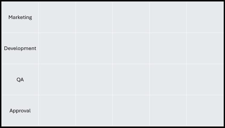
- Resize rows. Select the lane rows, go to Table Layout → Cell Size, and set Height to 1.5–2 inches. Consistent row height makes the diagram readable at a glance; defaults are useless for this. You can try 1.88″ tall rows for a normal full-page sized PowerPoint table with 4 rows.
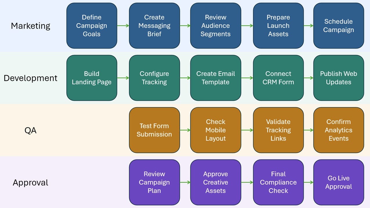
- Add process shapes. Insert → Shapes → Rounded Rectangle. One shape per step, placed inside the correct lane row. For a content workflow: Request → Draft → Review → Approval → Publish, each in its own shape.
 Connect with line arrow or elbow arrow connectors. Insert → Shapes → Line Arrow / Elbow Arrow. Connectors snap to anchor points and stay attached when you reposition steps. Make sure you actually connect the arrows to the dots if you want to connect it.
- Clean up formatting. Select the table, go to Table Design, and set borders to light gray or No Border. You can also select rows and make each swimlane have its own background color and select all the elements to change the background of each element as well:
Done. That’s a working swimlane. Everything below is about doing it better.
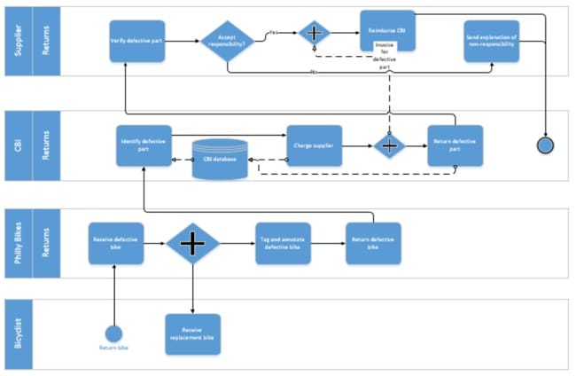
What a Swimlane Shows and When to Use One
A swimlane diagram is a process map divided into horizontal or vertical lanes, with each lane assigned to a person, team, department, or system. The whole point is to show handoffs – who does what, and when responsibility transfers.
Use one when handoffs matter: content approvals, customer onboarding, bug triage, procurement sign-offs, or cross-functional project stage gates. If every step in a process belongs to one person, a regular flowchart is cleaner.
PowerPoint works fine for a one-time presentation with fewer than about 12 steps. When the workflow changes often, ties to dates, or gets maintained across multiple reporting cycles, switch to a diagramming tool. Building the same swimlane in PowerPoint for the fifth time in a quarter is the wrong kind of discipline.
Method 1: Build a Swimlane Using a PowerPoint Table
The table method is the right default for most people. Fast, predictable, and the lane structure stays anchored in the background while you layer shapes on top.
Table geometry: For a horizontal swimlane, use rows for lane owners and columns for stages. Create one narrow label column plus 4–6 stage columns – something like Intake, Review, Build, Approve, Launch. Add one header row plus one row per lane owner. Put stage names in the top row, owner names in the first column. If your process doesn’t have distinct stages, keep the extra columns as invisible spacing guides and place process boxes freely on top.
Type each lane name in the first column. Rotate text if you prefer a vertical label: Format Shape → Text Direction → Rotate 270°.
Some people might skip this: Locking the table is a good idea. Right click on the table and choose “Lock” – this will stop you from accidentally selecting the table dividers and resizing anything. It will also lock the text, so unlock (right click > Unlock) if you need to modify any cell text.
Remove or lighten table borders under Table Design → Borders. A 15–20% opacity fill per lane is enough visual separation without overwhelming the process boxes on top.
Method 2: Use Rectangles and Lines Manually
Skip the table when you need full control – non-standard lane widths, vertical lanes spanning the full slide, or a layout that doesn’t fit a grid.
Draw one rounded rectangle per lane. Size the first one exactly, then copy-paste for subsequent lanes so they start identical.
Use Align and Distribute. This is the feature most PowerPoint users ignore and then wonder why their shapes look slightly off. Select all lane rectangles, go to Shape Format → Align → Distribute Vertically (or Horizontally for vertical swimlanes). PowerPoint spaces them evenly. Then Align Left to lock their starting edges.
After positioning, group each lane background with its label: select rectangle and label together, press Ctrl+G. Rename the group in the Selection Pane. Grouping a bare rectangle with nothing attached does nothing useful – always include the label.
Use Elbow Connectors, not plain lines. Elbow Connectors snap to anchor points on your process shapes. Plain lines don’t. Every time you use a plain line, you’re committing to manually repositioning arrow endpoints for every change. Not worth it.
Method 3: SmartArt as a Starting Point
Use SmartArt as a 90-second wireframe, then immediately convert it to free shapes. Don’t try to build a finished swimlane inside SmartArt itself – you’ll lose.
PowerPoint has no native swimlane SmartArt template. The closest options are Chevron List or Vertical Box List under the Process category. Insert one, populate labels, then right-click the entire SmartArt object → Convert to Shapes. Depending on the template, you might have to go to View → Slide Master if you can’t select the SmartArt object.
Once converted, you have individual, fully editable shapes. SmartArt just gave you a proportional starting layout you didn’t have to build from scratch.
For example, I found the Chevron template in PowerPoint, and quickly copied the shapes from the Slide Master to produce this simple swimlane row:
Good for quick internal diagrams where the audience cares about content, not polish. For a client deliverable or exec deck, Method 1 or 2 gives more control with less frustration.
Formatting Tips That Make PowerPoint Swimlanes Actually Readable
Before you draw anything: turn on gridlines (View → Show → Gridlines) and guides (View → Show → Guides). Enable Snap to Shape under Shape Format → Align → Snap to Shape. These three settings together cut alignment work by half.
Color is where most swimlane diagrams fall apart. One muted fill per lane – not white, not primary-color saturated. Use a 10–20% tint of your brand color per lane, or neutral grays. Reserve bright or saturated color for decision diamonds, bottlenecks, and risk flags. When everything is colorful, nothing stands out.
Font size: process step labels at minimum 11pt. Lane headers at 14pt, bold. Below 11pt on a projected slide, people in the back squint – which means they’ve stopped reading your diagram.
Leave at least 8–10pt of padding between the lane boundary and any shape inside it. Cramped lanes signal a rushed diagram. If a lane feels tight, expand the lane. Don’t shrink the shapes.
Arrow direction: pick one and hold it. Left-to-right for horizontal, top-to-bottom for vertical. Mixed directions in the same diagram create cognitive friction that’s subtle but real.
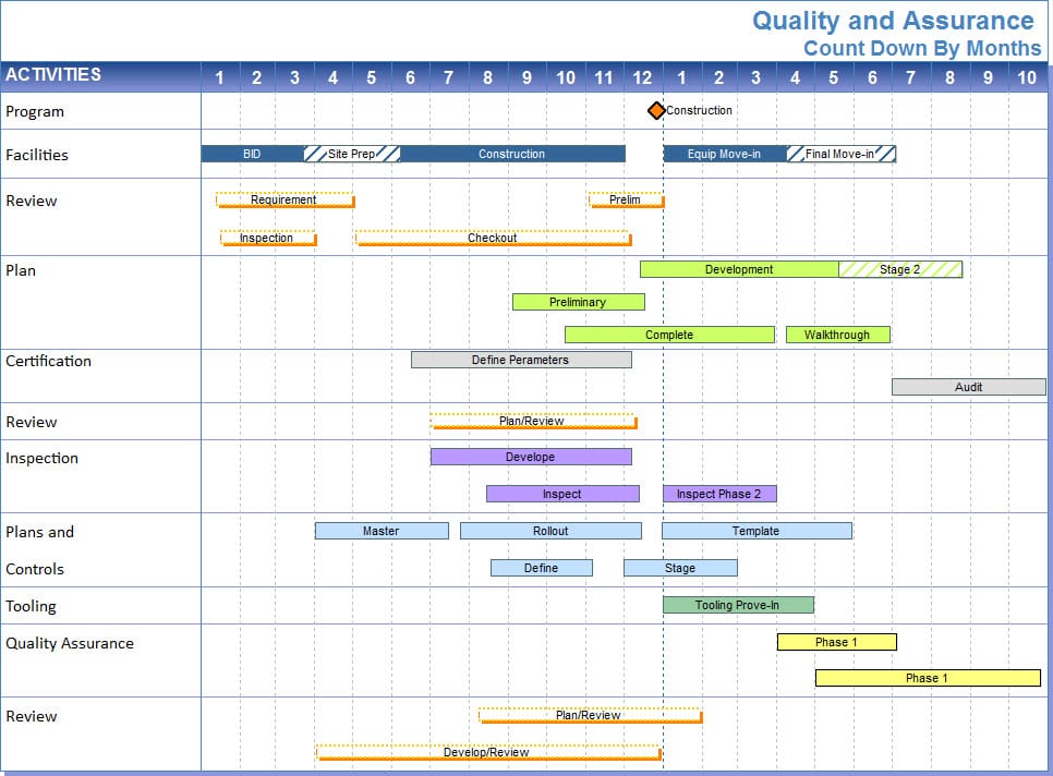
When a swimlane doubles as a rough project timeline – which it often does in program readouts – add milestone markers at key handoff points. A diamond shape, a contrasting color, and a date label takes two minutes and dramatically improves executive readability. If you’re maintaining these diagrams across multiple reporting cycles, tools like Milestones Professional, Visio, or Lucidchart are easier to update and export cleanly than a hand-built PowerPoint slide.
Connector Troubleshooting
Elbow connectors stay attached to shapes when you move them. That’s the good news. The bad news: PowerPoint doesn’t intelligently reroute complex paths. Move a step across a lane boundary and the connector may stretch into an ugly diagonal or route through another shape.
When that happens: select the connector, go to Shape Format → Edit Shape → Reroute Connectors. That resets the path to PowerPoint’s best guess, which is usually better than what the drag left behind. If it’s still wrong, grab the circle handles on the connector to adjust the elbow manually.
If a connector endpoint detaches (which happens when shapes overlap during editing) drag the connector endpoint back onto the shape’s connection point until PowerPoint snaps it in place.
Exporting and Sharing
Save a locked version before you send anything. File → Export → Create PDF/XPS for a PDF, or File → Save As → PNG for a high-resolution image. Either format prevents recipients from accidentally moving shapes, detaching connectors, or resaving a half-edited version as the new master.
For shared review, PDF beats sending the .pptx unless you actually want feedback on the diagram structure. I’ve gotten too many decks back with lane rectangles dragged out of position and connectors pointing nowhere. Send the PDF; keep the editable source.
The same logic that applies to exporting a clean project visual for executive review applies here: your source-of-truth diagram can live anywhere, but what gets shared should be a polished, intentionally formatted export – not a working draft.
Limitations of PowerPoint for Swimlane Diagrams
No smart auto-routing. After you move a step, you may need to reroute connectors manually. On a 15-step diagram, that’s a real time cost across every revision.
Doesn’t scale past about 12 steps. I’ve tried building 20-step cross-functional diagrams in PowerPoint. By the third revision, you’re fixing shape alignment instead of thinking about the process. That’s the signal you’re in the wrong tool.
No data linking. A PowerPoint swimlane is a picture. It doesn’t connect to a schedule, a task list, or a live status feed. If a step moves, someone manually updates the slide.
Collaboration friction is underrated. Two editors in the same file will corrupt shape layers, accidentally move anchored objects, or overwrite connector edits. For a diagram owned by one person, fine. For a team artifact, use a dedicated tool.
Many project managers default to PowerPoint swimlanes because it feels like reusing tools they already know. But the time spent building a 15-step diagram in PowerPoint – with manual alignment, connector fixes, and formatting passes – often exceeds the time it would take to learn Lucidchart or draw.io for that specific use case. The “no new tools” instinct costs real hours. Build more than two swimlanes per quarter and a 30-minute investment in a new tool pays back fast.
Alternatives worth your time: Lucidchart, draw.io (free), Miro, and Visio.
Build the diagram. Deliver the slide. Know when you’ve outgrown the tool.