
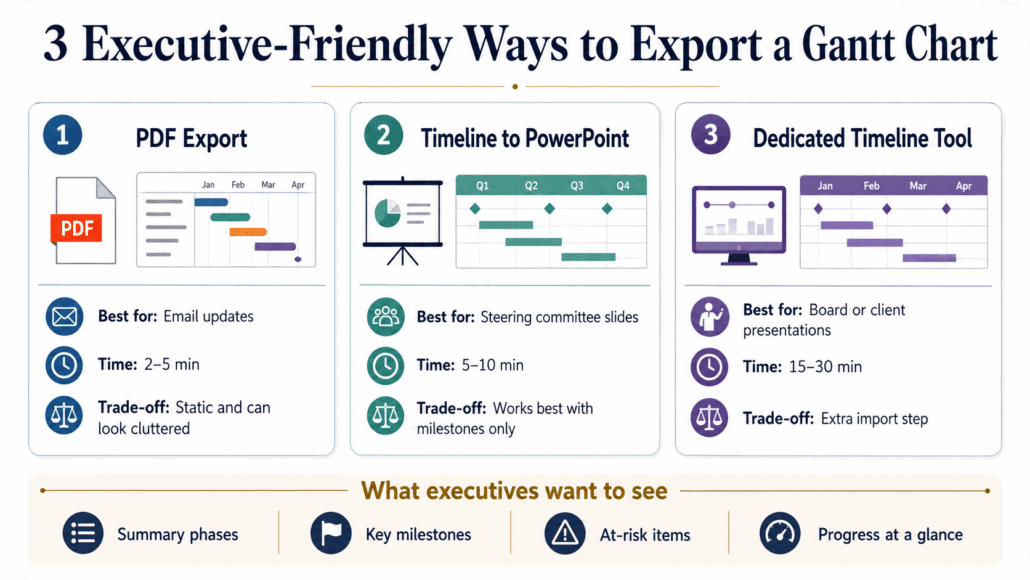
To export a Microsoft Project Gantt chart for executive review, choose the format based on how it will be used: a PDF from File > Print takes under two minutes and works well for email; the built-in Timeline view copies directly into PowerPoint; and a dedicated timeline tool gives you more control for a polished board or client presentation. Each approach has real trade-offs in time, editability, and how clean the output looks on a conference room screen. These instructions assume Microsoft Project desktop — Project for the web has different export and timeline options.
The Fastest Ways to Export a Microsoft Project Gantt Chart for Executives
Before picking a method, be clear about where the output is going. A quick status update for a weekly stand-up can tolerate a basic PDF. A board deck or steering committee presentation is a different situation — the chart needs to look prepared, not pulled straight out of your project file.
| Method | Best for | Editable? | Time required | Main limitation |
|---|---|---|---|---|
| PDF export | Email / shareable record | No | 2–5 min | Looks cluttered without prep |
| Copy Timeline to PowerPoint | Executive slide | Limited | 5–10 min | Works best with selected milestones only |
| Copy Picture | Quick image insert into Word or PowerPoint | No | 2–5 min | Static bitmap — low flexibility |
| Visual Reports | Excel/Visio dashboard, not a Gantt export | Yes (in Excel/Visio) | 10–20 min | Requires cleanup; not a timeline slide |
| Dedicated timeline tool | Polished board or client deck | Yes (varies by tool) | 15–30 min | Extra import step when schedule updates |
Use Visual Reports only when leadership wants a workbook or dashboard view. If the deliverable is a timeline slide, use Timeline, Copy Picture, PDF, or a dedicated timeline tool instead.
Executives rarely need the full work breakdown structure. What they’re looking for: which phases are done, what’s coming up, whether anything is at risk, and whether you’re on track.
Which Export Method Fits Your Situation
Not every executive review is the same. Use this as a quick reference before choosing your approach:
| Scenario | Recommended method |
|---|---|
| Weekly email status update | PDF from File > Print, collapsed to summary level |
| PowerPoint steering committee slide | Copy Timeline > For Presentation, paste into slide |
| Board or client presentation | Dedicated timeline tool imported from .mpp |
| Recurring monthly update | Save an “Executive Review” view in Project; export as PDF or Timeline |
If your audience expects to see whether dates have moved since the last review, show baseline bars or a schedule variance column. But only where it helps explain risk — exposing baseline dates when the project is on track adds noise without adding meaning.
Showing schedule movement. If the review is about what changed, turn on baseline visibility before exporting. In Microsoft Project, set or confirm your baseline under Project > Set Baseline. Then switch to the Tracking Gantt view, or add a Finish Variance column to your active table. Show baseline bars only for phases or milestones where the change is significant; for everything else, explain the variance in a short callout next to the bar. A colored bar shows that something slipped — a plain-English note tells them what you’re doing about it.
Before exporting, check what’s visible in your view. Resource names, internal task descriptions, and cost data may be appropriate for your team but not for an executive audience or an external client. Strip anything that shouldn’t leave the building.
Format for the medium. Use landscape orientation for email PDFs — it renders well on a laptop screen without scrolling. If the output will be projected, design around a 16:9 PowerPoint slide from the start. A landscape PDF squashed onto a widescreen slide looks like an afterthought.
What Executives Actually Want to See (Before You Export Anything)
The single most useful thing you can do before exporting is filter your view ruthlessly. Collapse your task list to summary-level rows only. If you have 200 tasks in your project, an executive presentation should show 10–15 lines at most — phases, major milestones, and key dependencies.
In Microsoft Project, use the outline controls to show only summary levels, or create a filtered view that includes only summary tasks, milestones, and items with variance. Then save it. File > View > More Views > New — name it “Executive Review” and it’s there every time. You’re not rebuilding the view from scratch before every monthly export.
Think about what reads in 10 seconds. When a slide goes up in a meeting, the executive at the back of the table has roughly that long before attention moves on. If they can’t tell whether the project is green, yellow, or red in that window, the chart isn’t doing its job.
Color-coding by phase or by status is one of the highest-value adjustments you can make. A simple three-color system — on track, at risk, delayed — communicates more than any column of dates. Pair that with clear milestone markers and a visible percent-complete indicator and you’ve covered most of what leadership actually asks about.
One accessibility note worth taking seriously: don’t rely on red/yellow/green color alone. A meaningful percentage of your audience is color-blind to some degree, and projectors frequently wash out warm colors. Add text labels or short callouts alongside status bars so the information survives without color. “Recovery plan due Friday” does more work than a yellow bar.
Option 1 — Export Directly from Microsoft Project (PDF and Image Routes)
The PDF route is the most straightforward. Go to File > Print, select a PDF printer (or use File > Export > Create PDF/XPS in newer versions), and you’ll capture exactly what’s visible in the current view. The catch is that “exactly what’s visible” can mean a cluttered mess if you haven’t cleaned up first.
Before printing, set up your view:
- Collapse all tasks to summary level only
- Hide columns you don’t need by right-clicking column headers and selecting Hide Column — ID, Duration, and Resource columns add noise for executives
- Drag the split bar (the vertical divider between the task table and the Gantt bars) so only the columns you want to print are visible on the left
Once the view is clean, go to File > Print > Page Setup to control scaling, date range, headers/footers, and whether the legend prints. Specific settings to check:
- Set Scaling to Fit to 1 page wide
- Remove or simplify the legend
- Set the date range to the current quarter plus the next — that’s usually the right window
- Preview at the size the executive will actually see it
If the bars become too compressed to read at that scale, split the schedule into two focused views rather than shrinking everything onto a single illegible page.
For an image export, use Task > Clipboard > Copy > Copy Picture. Choose whether to copy selected rows or visible rows, set the timescale range, and select For Screen or For Printer. Paste the result into PowerPoint or Word. In older versions, Copy Picture appears under the Edit menu or the right-click context menu.
Option 2 — Use the Microsoft Project Timeline for PowerPoint
Microsoft Project’s built-in Timeline view is the fastest path to a presentation-ready slide. Find it under View > Timeline — it adds a simplified horizontal bar across the top of your screen showing key tasks and milestones in a condensed format.
Getting the right tasks onto the Timeline is where most people get stuck. Here’s the actual workflow:
- In the Gantt Chart view, select the summary tasks and milestones you want to surface — hold Ctrl to select multiple rows
- Right-click the selected tasks and choose Add to Timeline
- Remove any low-level tasks that slipped through — right-click them in the Timeline and choose Remove from Timeline
- Click the Timeline to activate it, then use the Format tab to adjust date format, bar and callout style, and text labels
- Right-click the Timeline and choose Copy Timeline > For Presentation
- Paste directly into your PowerPoint slide
“For Presentation” keeps the resolution sharp on larger screens. The result is a clean bar chart most executives can read at a glance without you narrating every element.
Visual Reports (Report > Visual Reports) push project data into Excel pivot charts or Visio diagrams. Useful if leadership wants a schedule dashboard in Excel — but not a Gantt export, and not a timeline slide. Don’t conflate the two.
Option 3 — Dedicated Timeline and Presentation Tools
When native exports aren’t producing the quality you need — or when you’re presenting to a particularly demanding audience — purpose-built timeline software is worth the extra step.
Tools in this category may import Microsoft Project data directly from .mpp files or indirectly through XML, Excel, or CSV, depending on the product. Milestones Professional imports .mpp files and gives detailed control over phase bars, milestones, symbols, and status indicators. Office Timeline works as a PowerPoint add-in and imports from .mpp or Excel. Smartsheet and TeamGantt have their own import paths and work better for teams already living in those platforms.
Before choosing one, confirm the import format and whether updates require a full re-import or can be refreshed incrementally. Some tools handle this gracefully; others require you to rebuild the timeline from scratch every time the schedule changes.
The trade-off is real: you’re adding an import step. But if the presentation is going to a board, a client, or a C-suite sponsor, the visual improvement is usually worth it.
Formatting Tips to Make Any Gantt Export Look Executive-Ready
Regardless of export method, these adjustments make a consistent difference:
- Collapse to summary tasks only before exporting — aim for no more than 10–15 rows
- Remove the ID, Duration, and Resource columns from view; keep Task Name, Start, Finish, and Status
- Use a white or light background — dark Gantt themes print poorly and look rough when projected
- Add a header with a title, the current date range, and the project owner — the export should stand alone without you explaining what it is
- In PowerPoint, place the Gantt as a single image on one slide with a brief two-line status summary alongside it — don’t let it compete with bullet points
The header point is easy to skip and frequently causes problems. If an executive pulls up a PDF from three weeks ago and can’t tell when it was generated, you’ll spend the first five minutes of the meeting establishing context instead of discussing the project.
Before You Send: A Pre-Export Checklist
Run through this before you hit send or walk into the room:
- Project > Status Date is set correctly so the export reflects the intended reporting period
- Underlying task progress is updated and summary percent-complete values have been verified
- View is collapsed to summary level only — no subtasks visible
- Any red or yellow items have a plain-English callout, not just a color
- Export includes a title, reporting date range, and version date
- Confidential details — resource names, cost data, internal task descriptions — are removed if this is going outside the team
- PDF or image opens correctly on a device that doesn’t have Microsoft Project installed
- Chart is readable at presentation size — zoom to 50% and check
- Format matches the medium: landscape PDF for email, 16:9 slide if it will be projected
Common Mistakes That Undermine Executive Gantt Exports
A few patterns come up repeatedly and erode the credibility of an otherwise solid schedule:
Exporting at the full WBS level. A 200-row Gantt tells an executive nothing except that you didn’t prepare. It reads as a data dump rather than a prepared communication.
Forgetting to update percent-complete before exporting. Stale progress bars are worse than no progress bars. If the chart shows 20% complete on a phase that’s actually 70% done, you’ve undermined your own status report.
Sending a raw .mpp file. Most executives don’t have Microsoft Project installed. A file they can’t open without IT help isn’t a deliverable.
No version date on the document. Executives reference materials between meetings. Without a date on the export, there’s no way to know whether what they’re looking at reflects last Tuesday or last quarter.
Keeping the default Microsoft Project styling. The standard blue bars with default fonts are recognizable as unformatted software output. Ten minutes adjusting colors, removing gridlines, and cleaning up column widths signals that this chart was prepared for this audience — because it was.
